My Opa (Grandpa) always said: “You learn something new every day!”
He was so right!
Even though we have self-published before we learned something new during our recent self-publishing adventure. Authors who publish a book with a different or special layout other than a normal book should keep an eye on this!
SPECIAL LAYOUT:
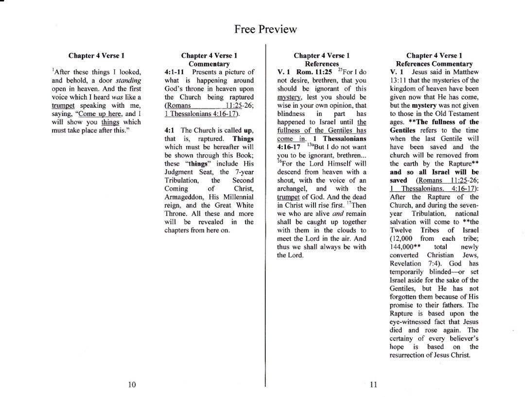
The Study Guide has a special layout as it has two columns of text per page. When you open the Study Guide you see four columns side by side over two pages. (Example below)
The way to study is to:
FIRST – read e.g. verse 1 of the true Scripture of Revelation in the very left column.
SECOND – you move over to the next column and read the commentary to verse 1.
Third – another column over you can find the text of the reference verse(s) -spelled out- that you found in the commentary referring to verse 1 (this way you don’t have to search back and forth for them in your Bible).
Fourth – coming to the very right column you find the commentary on the reference verse(s).
We chose this format so that without turning any pages the student can use time more effectively. This also promotes and enhances ease of understanding.
We emailed the manuscript to the designer who was going to prepare it for printing. He changed the font and spaced the lines appropriately to make reading more pleasant to the eyes of the reader. All of this was greatly appreciated.
However, and here is something you might want to keep an eye on if you have a special layout and self-publish.
The “page layout” we chose stayed the same which proved to be a serious mistake! We had set our pages at minimum margins in order to fit each chapter on one page and to keep everything side by side in context. (This is where the “NO” experience with special layout comes into play)! When you are self-publishing you have to educate yourself and be in discussion with the publisher/designer to get recommendations for change if necessary.
All the proofs we received via email looked great on the computer screen. When we finally received a printed copy we noticed that the inside of the Study Guide looked unprofessional with the text almost touching the binding due to the narrow margins!
So we went back to the drawing board We made the margins wider, cut the texts in the appropriate places to keep the context, and added a number of pages to the manuscript.
Originally we had 84 pages. Now we have close to 150 pages which is actually a good thing. With 84 pages the book was very thin and almost disappeared out of view on the bookshelf. Now with 150pages it should show up between the other books!
All in all a good and, in the end, valuable experience!
DO YOU HAVE ANY LESSONS LEARNED FROM SELF-PUBLISHING YOU WOULD LIKE TO SHARE?
Feel free to comment below or ask a question!
